the story.

branding & packaging design: JCPenney.
We were tasked with the challenge to fill a hole in our product offering by leadership; something current and easy to wear. The brand exists to make it easy for men to achieve casual style relevance; its style communicates a well-crafted, vintage-inspired look. The message is focused on creating easy and comfortable looks for his all-day life. I designed the logo, wordmark, tag shape, & string to coincide with the brand identity. It was one of my favorite brands to execute at JCPenney because of the style direction it took and the products offered within the line.
branding:
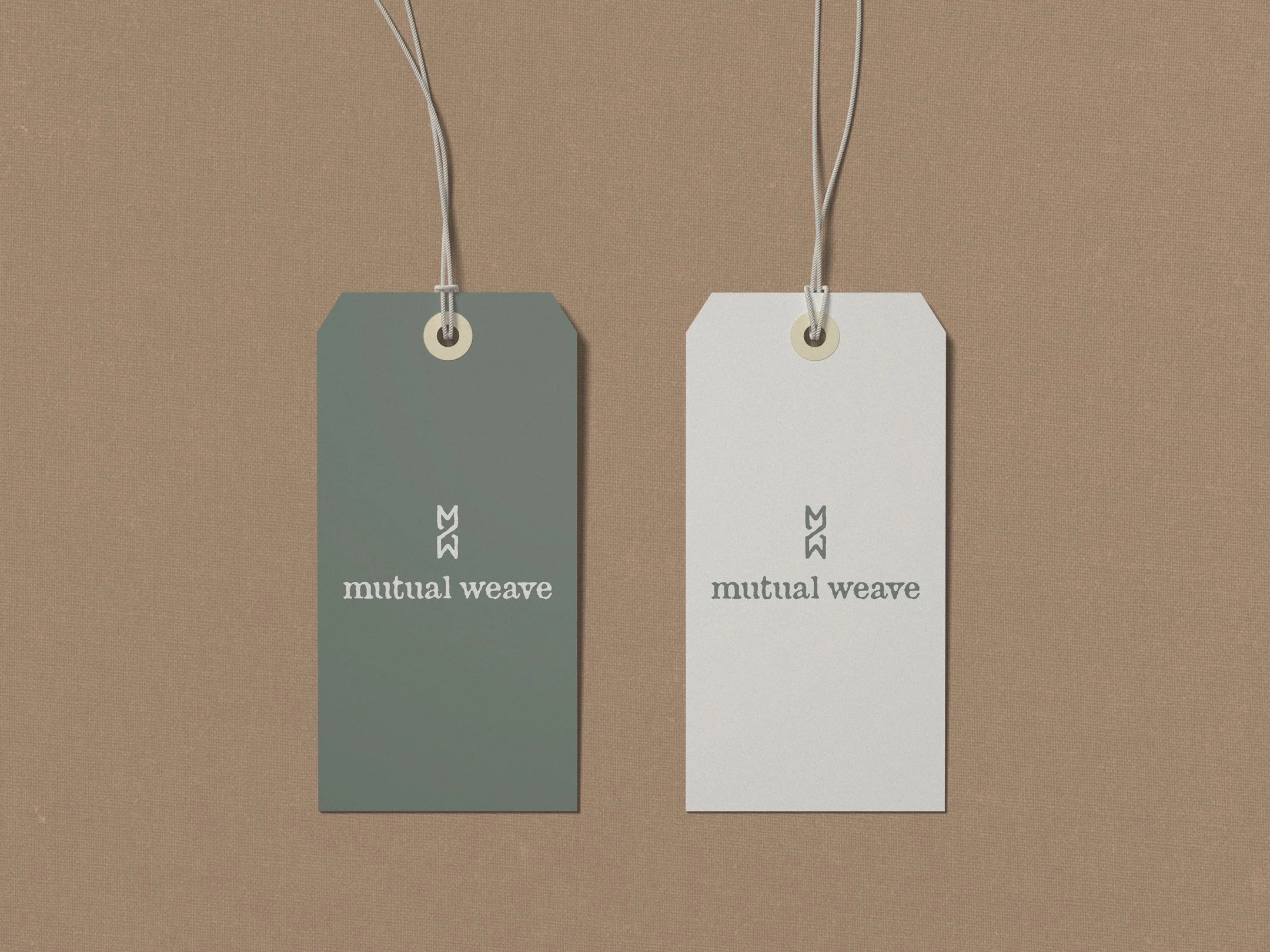
The main hang tag is the face of the brand in the store. Designing the logo, tag shape, color palette, string, and paper execution is vital to the voice of the brand itself.
Keywords: well-crafted, vintage-inspired, outdoor, easy & comfortable, casual style, grounded, relevant, modern simplicity, utility-inspired, washed & textured.
design:
The logo and wordmark were crafted to communicate the brand identity. The authentic voice of the brand values comes to life in the approachable typography and hand-crafted feeling of the logo.
Beginning with earth tones to ground the color palette within the core brand values; the cohesiveness of materials and the location of the initial photoshoot also package the brand as a complete unit.


outdoor mood


